NOKT
Brand identity, packaging and website for a plant-based sleep gummy.
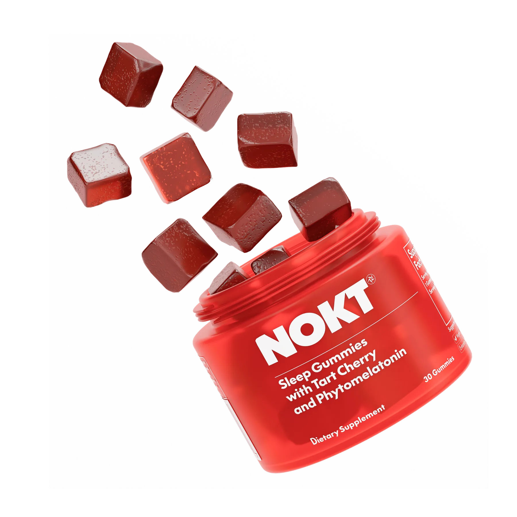
NOKT started with a simple but bold idea: sleep better to live better. Their product is a clean, plant-based gummy that delivers great sleep without the grogginess or weird side effects you get from traditional sleep aids. But they needed more than a great product; they needed a brand that could get people excited about it.
As the lead graphic designer, I played a pivotal role in bringing this vision to life. From the digital UX flow to the physical packaging, I ensured every customer touchpoint reflected NOKT’s core values of innovation, sustainability, and premium quality.
Initial Explorations
When I start a consulting project, the first step is always the same: Research and stakeholder interviews. Before I can design anything, it’s crucial for me to understand the company, the business, and their audience.
During our stakeholder interviews, I learned that the CEO, Lucas, got the idea for the product after one particularly grueling Ironman race where he only got two hours of sleep the night before.
This insight was interesting to me. When the team first approached me to lead the design they were headed in a very typical “sleep supplement” positioning strategy: think “Goodnight Moon” or Sleepytime Tea. Lucas’s story gave me the idea to bring this to market as a performance sleep product. After all, it was originally developed for Lucas’ athletic recovery.
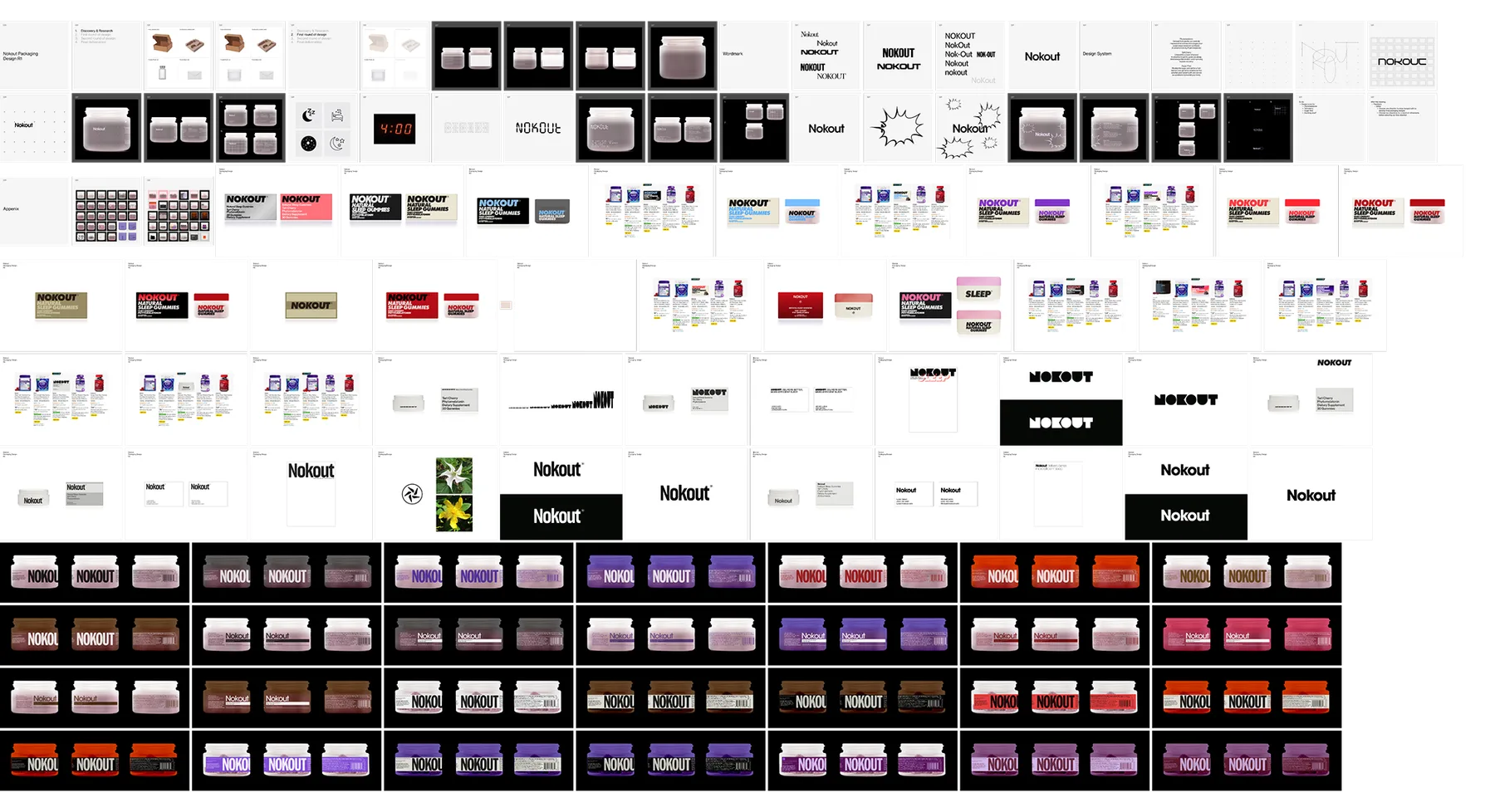
I always go wide before I go narrow. I do hundreds of iterations and explorations to make sure I fully understand the search space that we are working with. Then, I can start to identify potential solutions. It took me a few rounds of design to hone the aesthetic.
Brand Identity
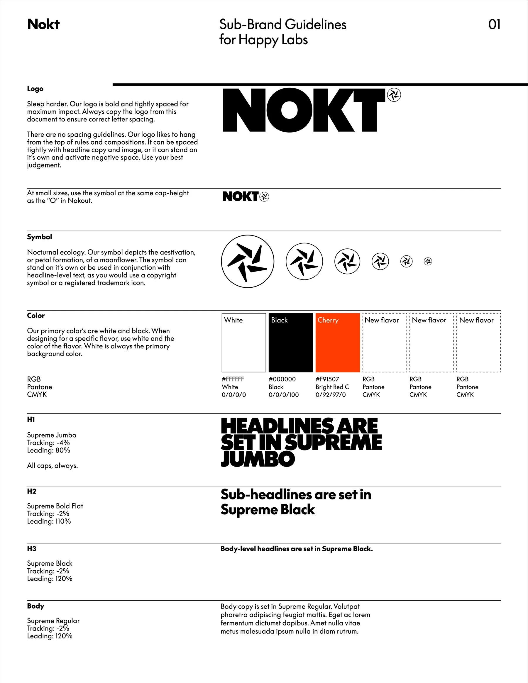
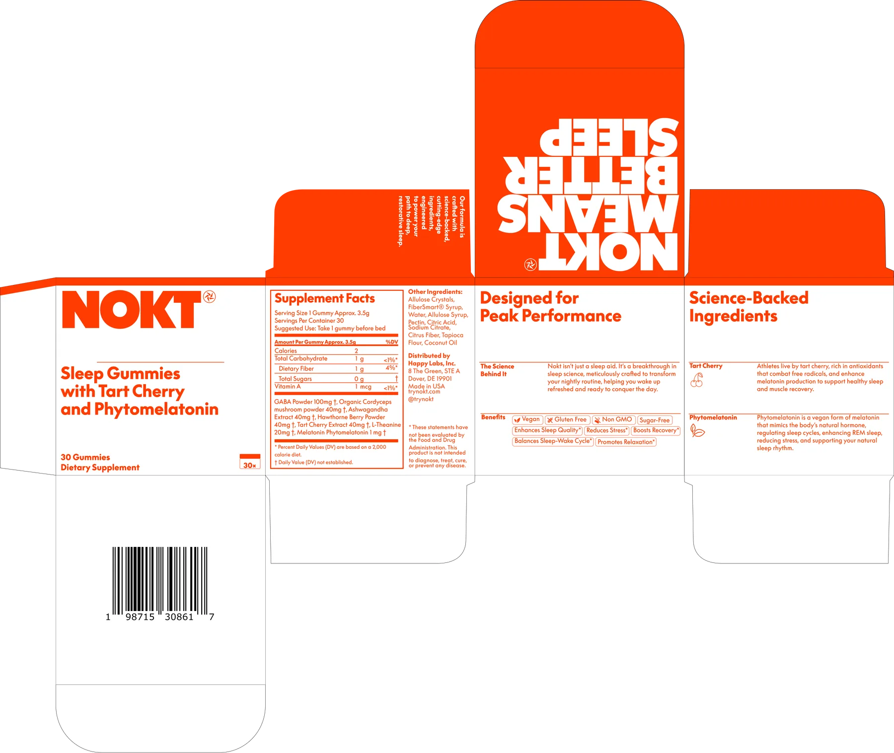
Final Identity and Packaging
Container Design
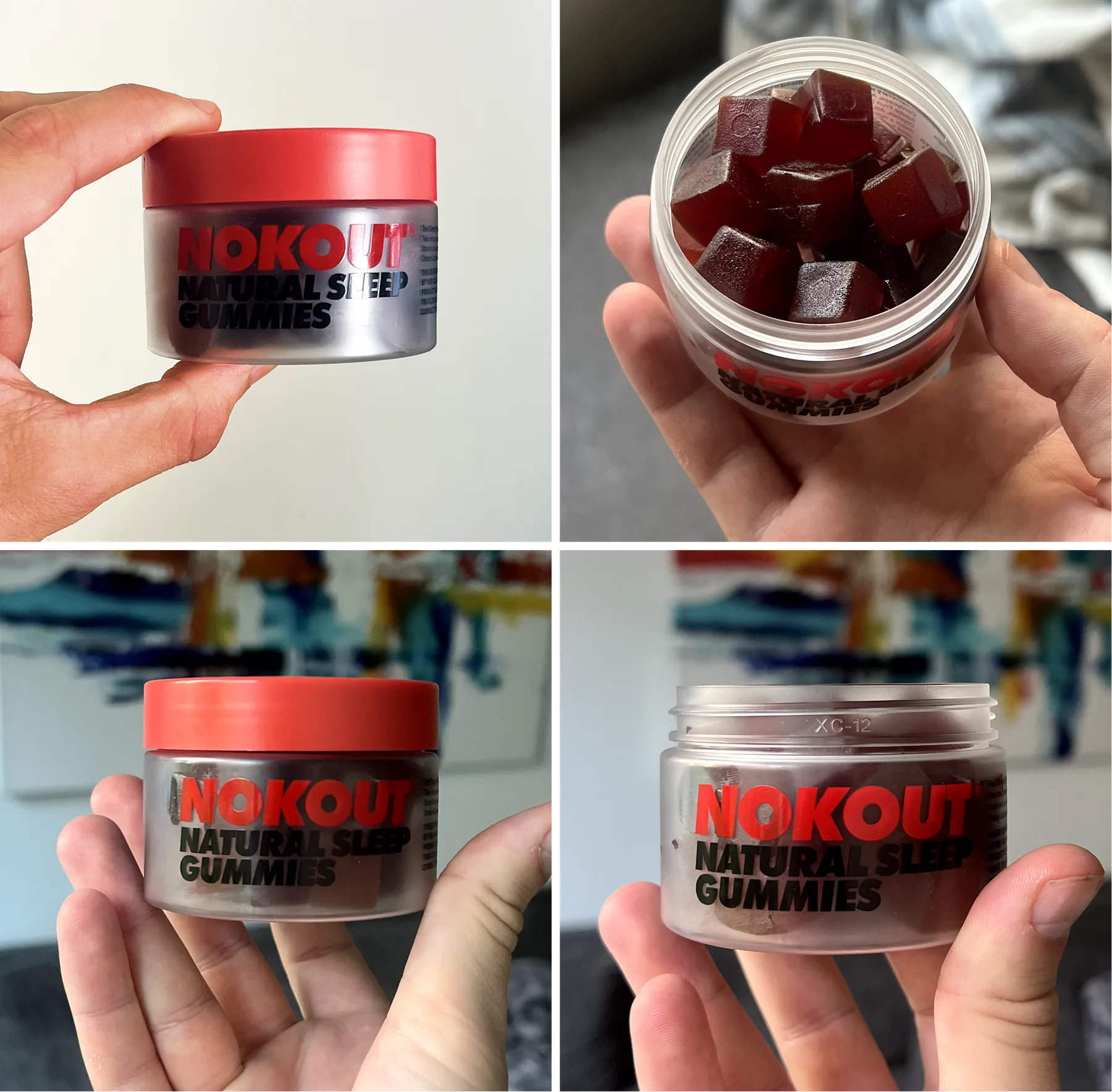
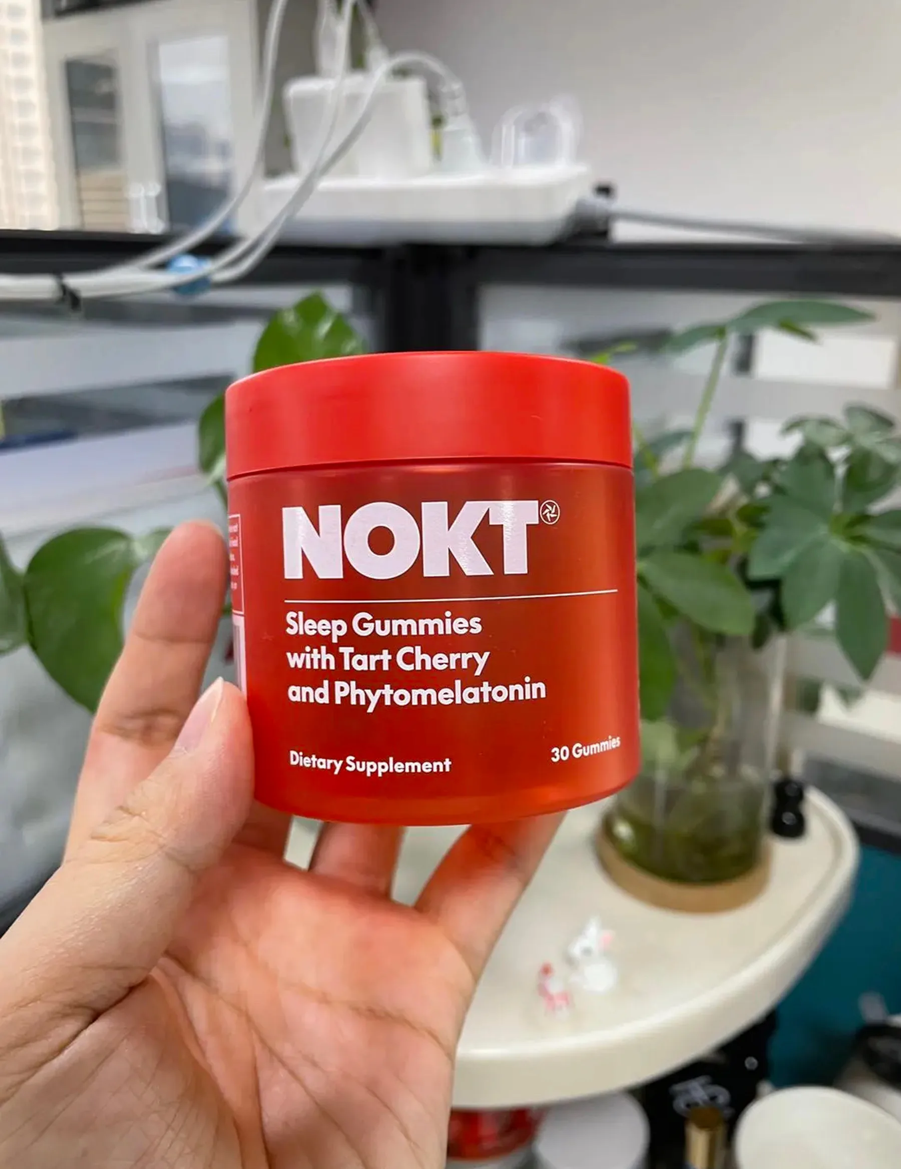
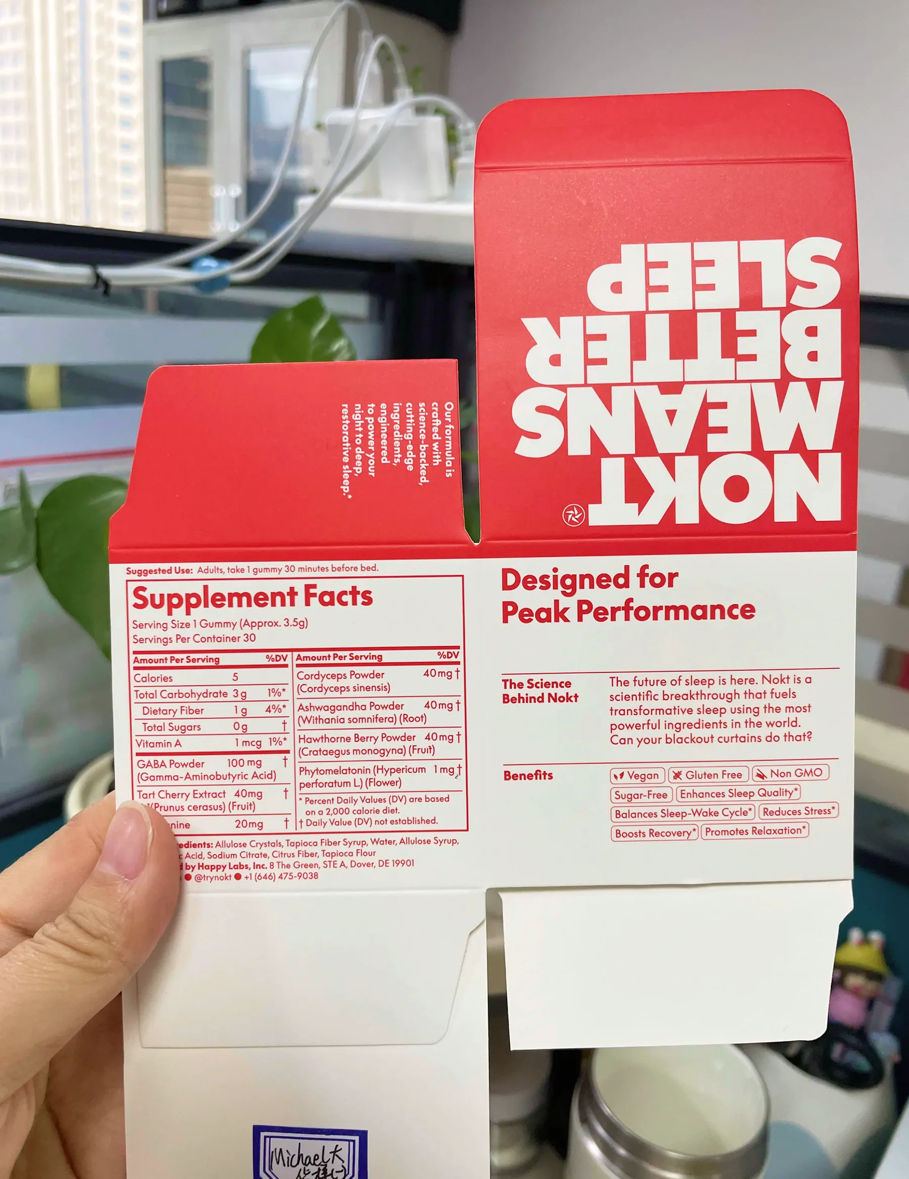
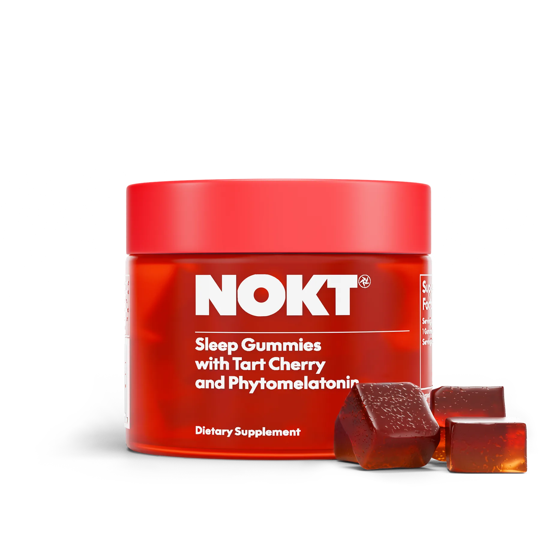
I wanted this container to be the kind of thing a friend would notice and ask about if they saw it on your bedside table. Our first batch of samples had the same vibe as our final design but came with some functional hiccups. While the design looked great on-screen and in mockups, we quickly realized that the dark text on the clear container became almost impossible to read once it was filled with our dark gummies. So, we made a switch to red-tinted plastic—a bold move! Pairing it with white text not only solved the legibility issue but also made the design stand out even more.
First Samples
The clear plastic and dark gummies on our first round of production samples rendered the brand typography illegible.
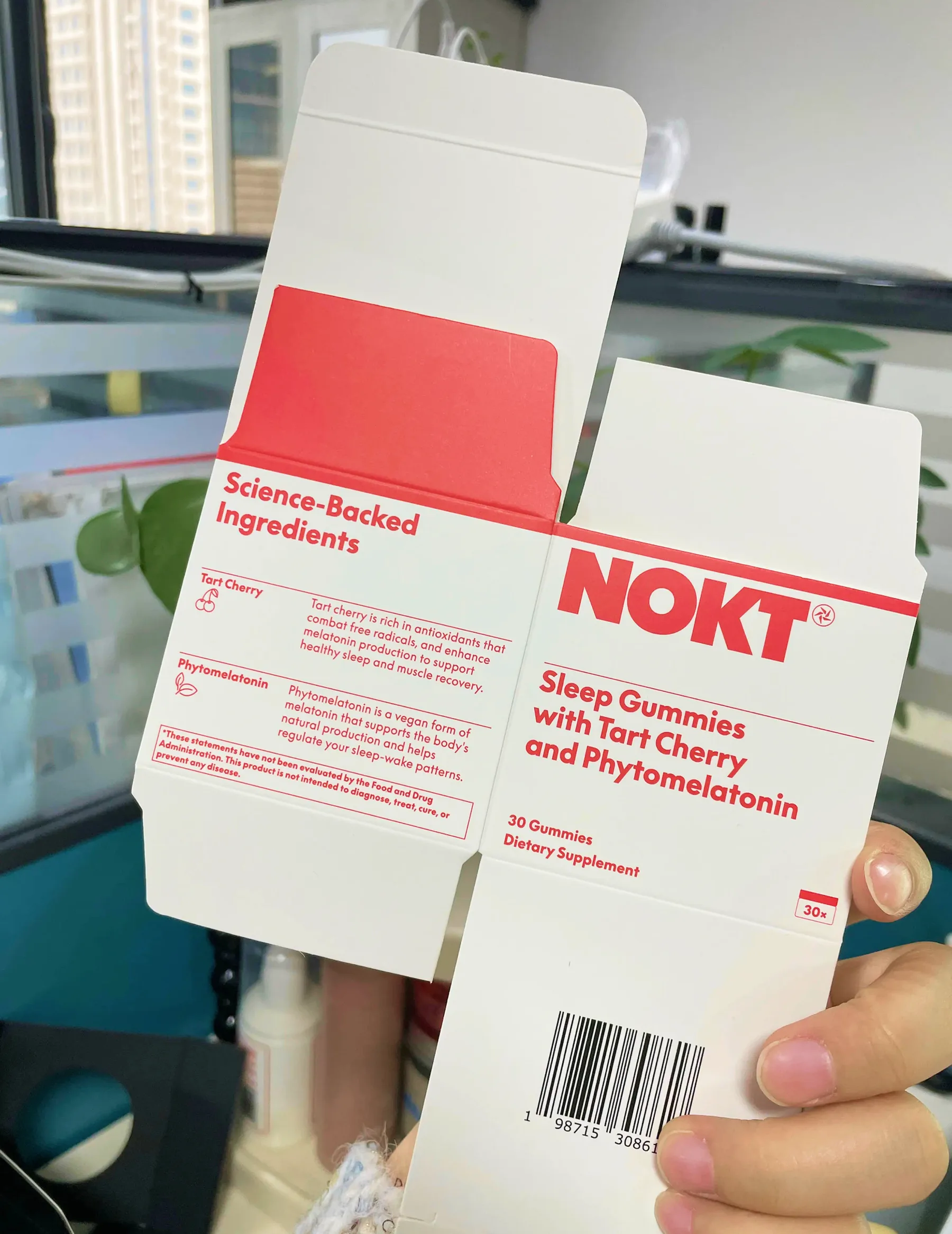
Final Packaging
We reworked the packaging for legibility and visual impact.
Interactive UI / UX
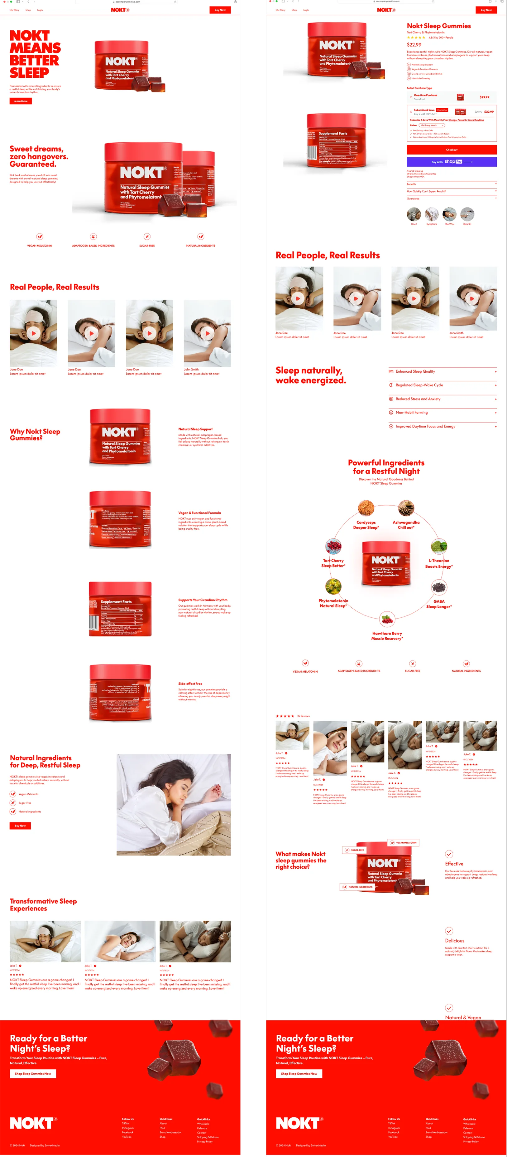
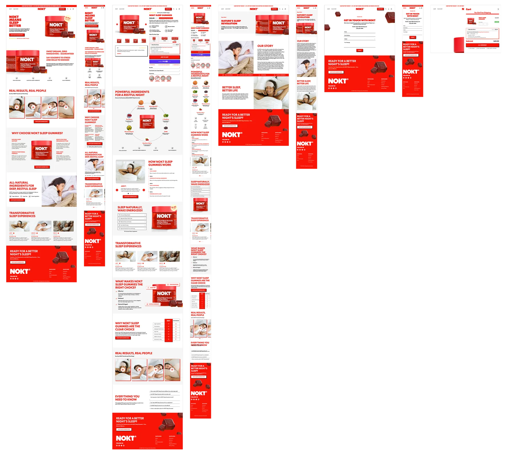
I worked with an external developer to design our direct-to-consumer website. My goal was to ensure the site stayed true to our brand identity while clearly highlighting key product details, like its plant-based ingredients and intended effects.
Initial Sketches
Final Design
- Skills
- UX Design
- Brand Identity
- Packaging Design
- Customer Experience
- Team
- CEO: Lucas Hazen
- CFO: Michael Larkin
- Lead Designer: Willie Shaw Fineberg