Limbo
Brand identity, website and app for a metabolic health and weight-loss system.
Limbo is a health and wellness system that enhances energy levels and accelerates weight loss by tracking biodata. Using specialized hardware, it monitors blood glucose, heart rate, sunlight exposure, and sleep patterns to provide insights into metabolic health.
When we joined the project, the company was still called VIV (Vitals in View). At a price of $1000+ with subscription fees, the product needed to match its premium promise. Collaborating with naming agency ZinZin, we rebranded it as Limbo, inspired by its focus on staying in the Fastid Zone.
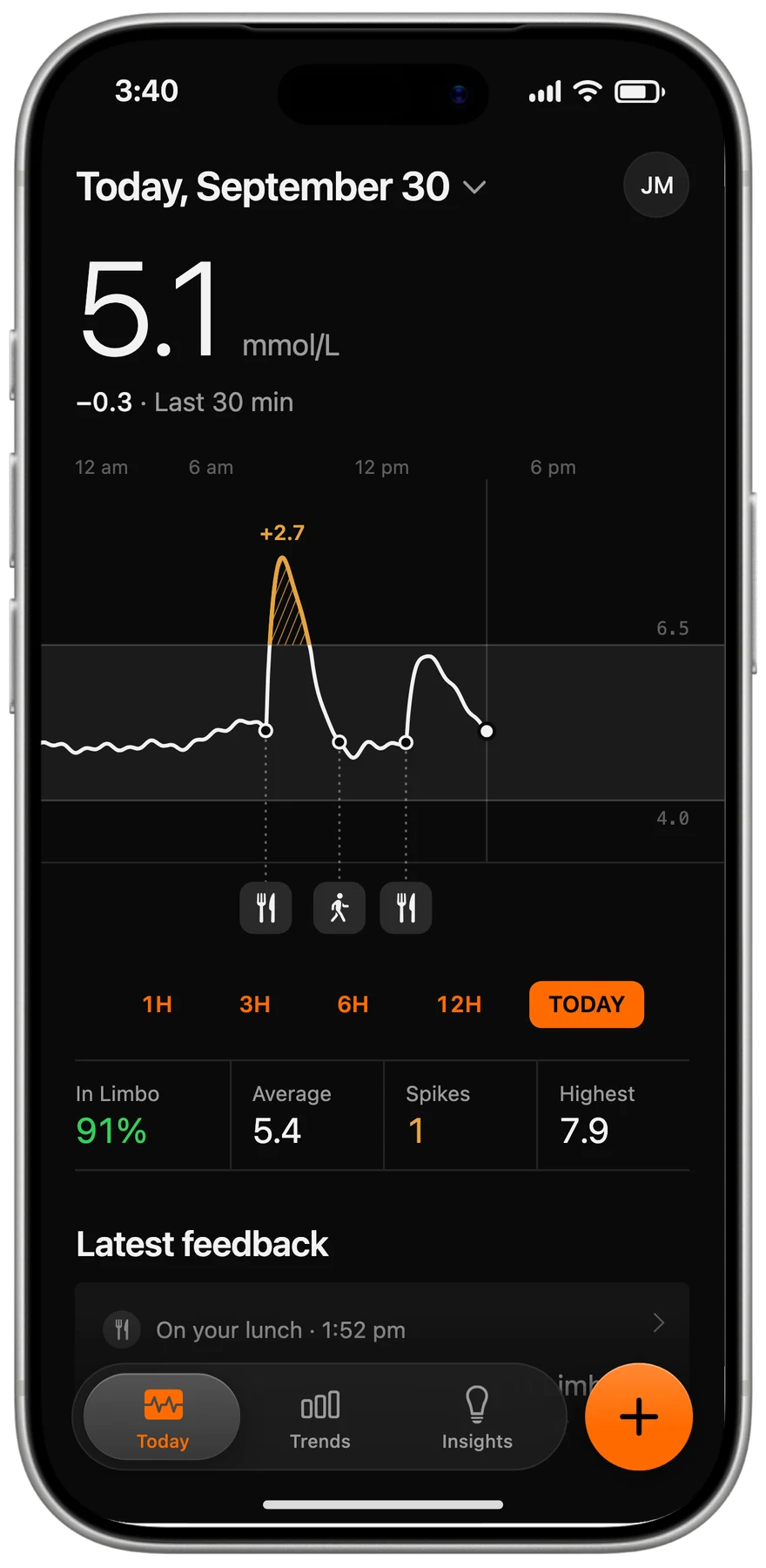
Onboarding
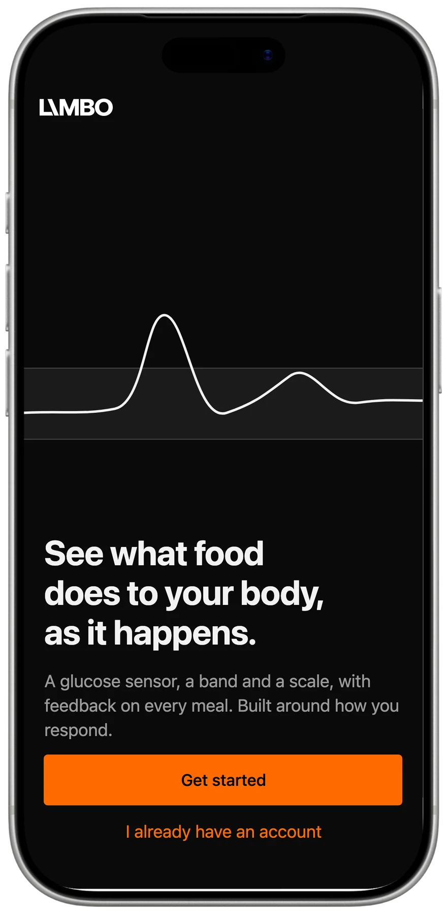
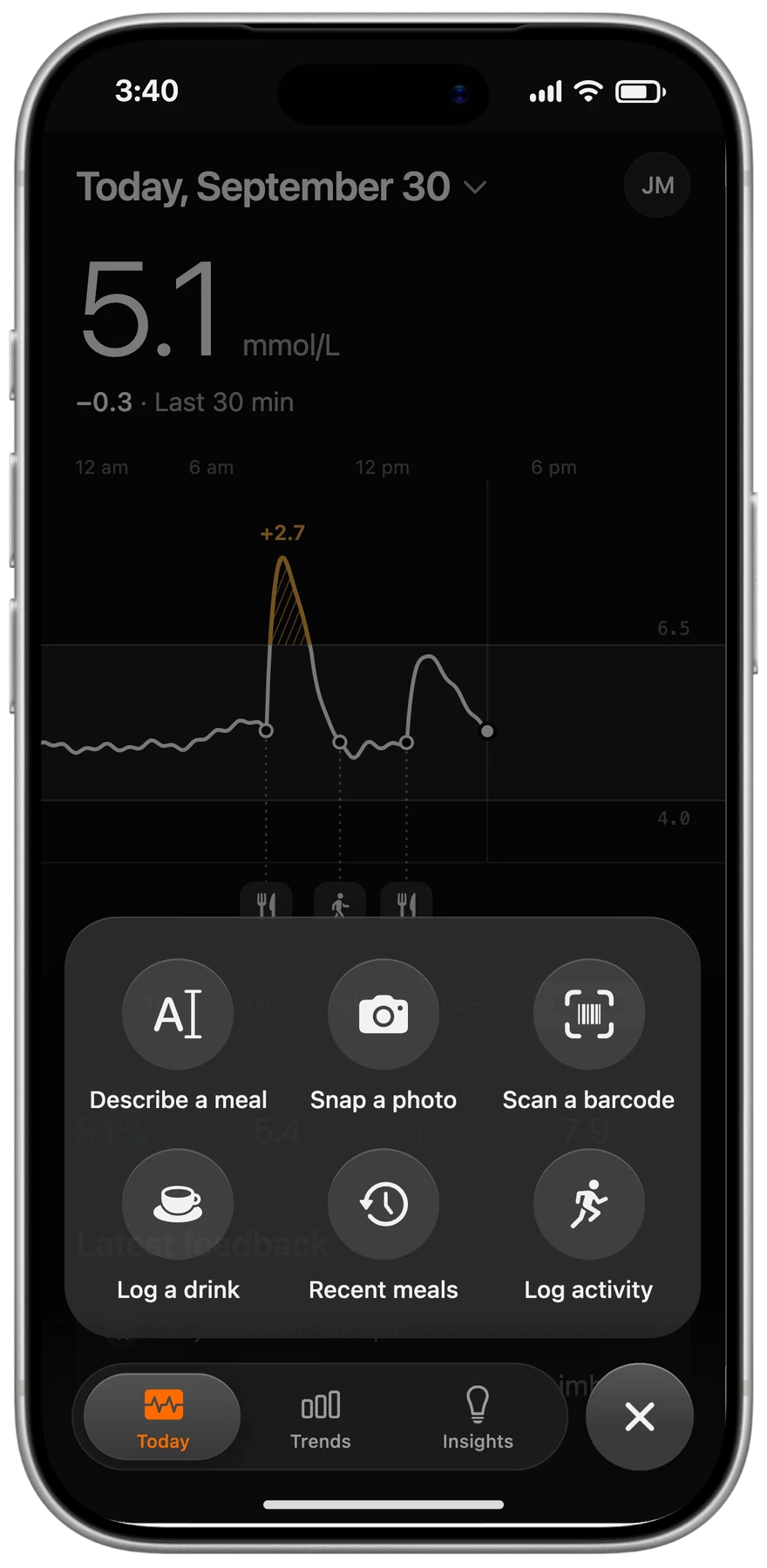
Limbo gives you a real-time window into how your energy system reacts to food, exercise and rest. Your body’s energy system is complex, but managing that system is an important factor in losing weight effectively.
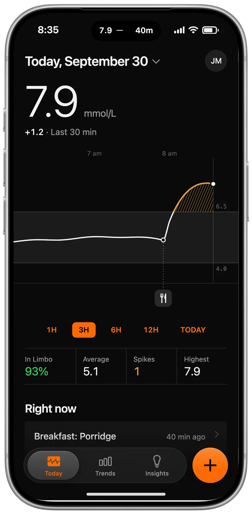
Scoring
Every meal gets feedback on what it did to your blood glucose, from “Excellent food choice, BG has remained in Limbo” to “Good food option, but the toast caused a spike. The carb content was too high.”
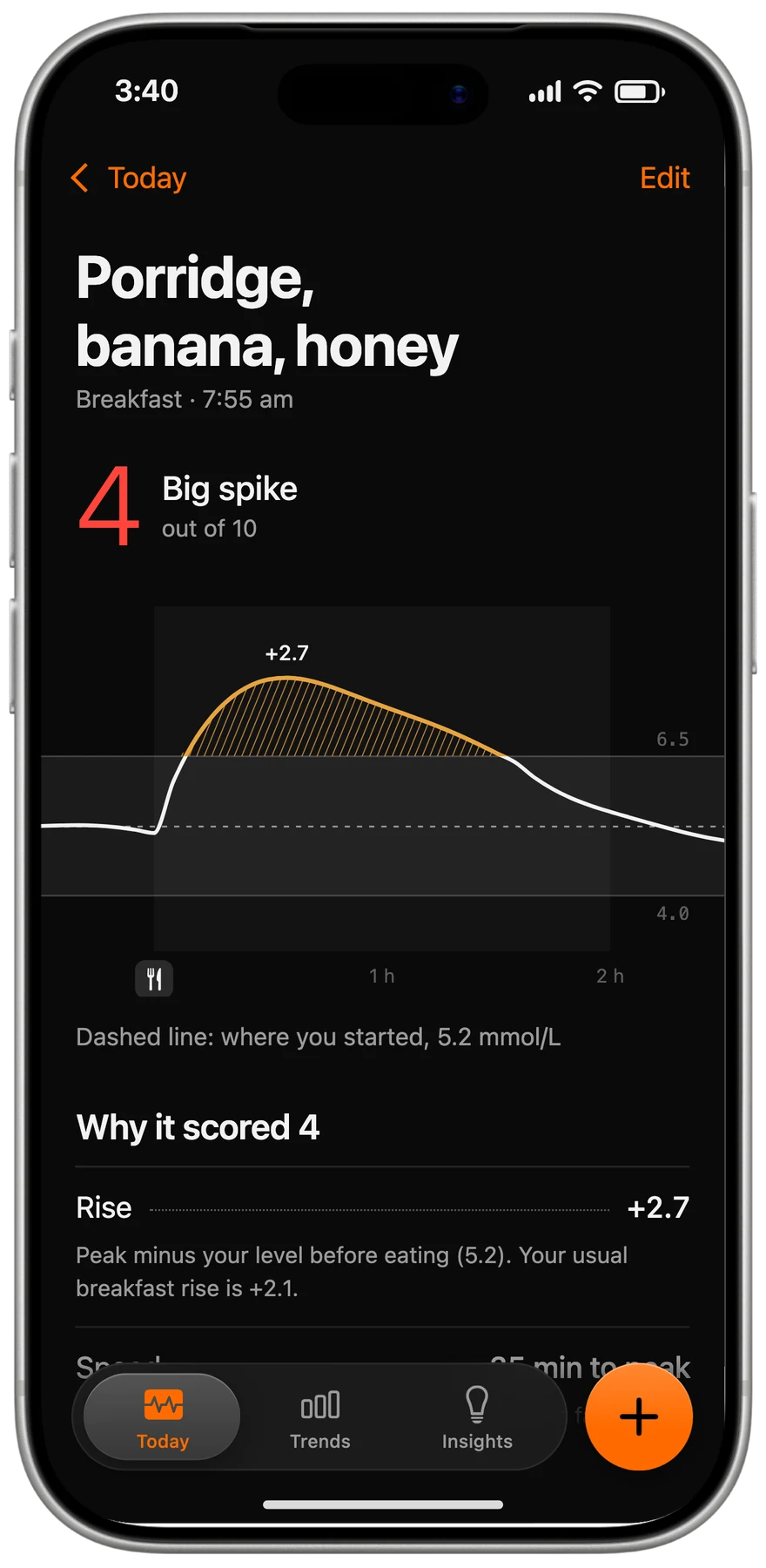
Logging
Log a meal and Limbo shows how your specific body reacts to it, then tells you what to do next: “Not a great choice, take a 30 min walk.”
Process
UX Audit
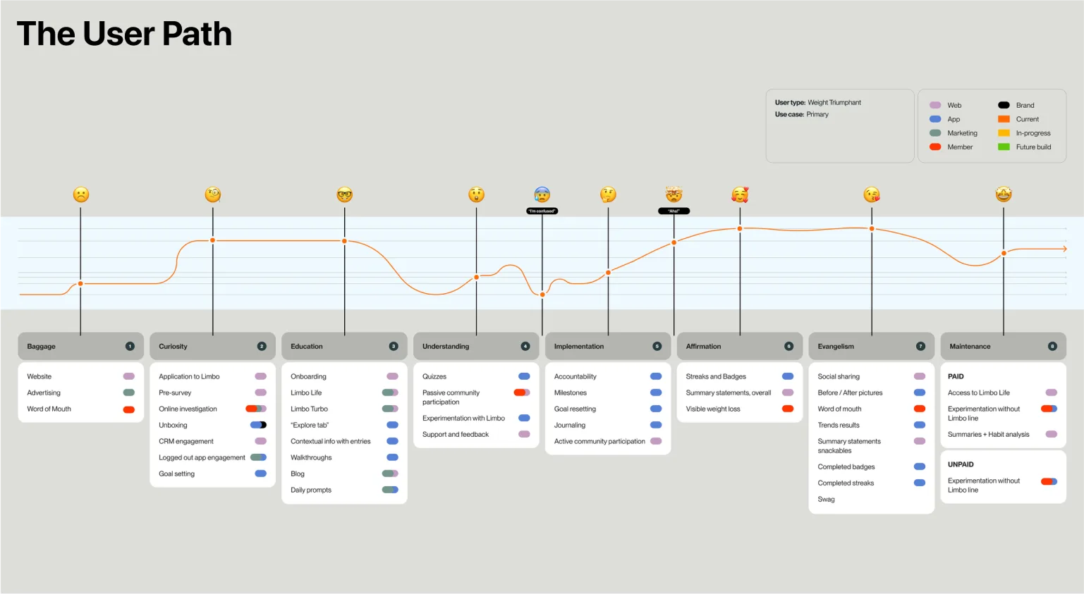
To support Limbo’s rebranding, we conducted a user experience audit to refine the customer journey, focusing on engagement, optimization, and retention. The audit explored seven stages: Baggage, Curiosity, Education, Understanding, Implementation, Affirmation, and Maintenance. This helped us pinpoint pain points and opportunities to enhance user trust and engagement.
Key insights
Curiosity & Education: Streamlined onboarding to explain the Fastid Zone and its benefits.
Implementation & Affirmation: Gamified tools (streaks, badges, milestones) to motivate progress.
Maintenance & Evangelism: Premium features and shareable moments to boost retention and advocacy.
This process delivered a user-first experience that connects actions to goals, ensuring a seamless, premium system aligned with Limbo’s mission.
Design System
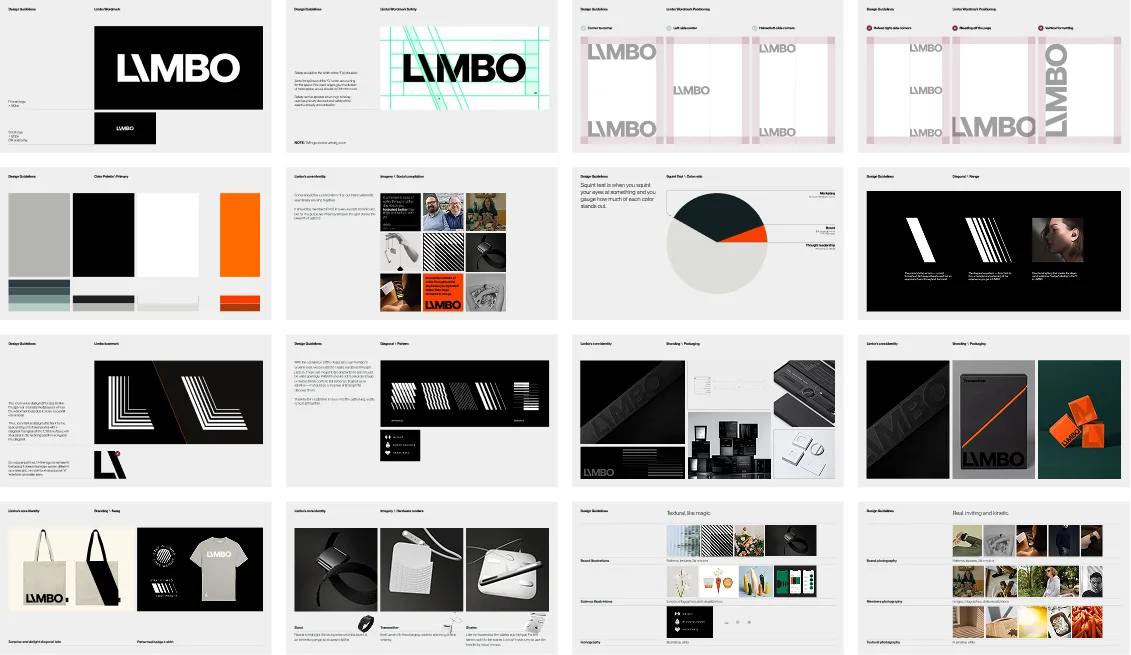
When building Limbo’s brand identity, we aimed for a sleek, premium look that matched its science-backed functionality and higher price tag. The design is clean and minimalist, with bold diagonal lines used thoughtfully to stay impactful without feeling too corporate. The brand’s style includes strong typography, a crisp black-and-white color scheme with pops of vibrant orange, and flexible layouts that work well across different platforms. The photography focuses on the products, steering clear of faces so users can picture themselves in the experience.
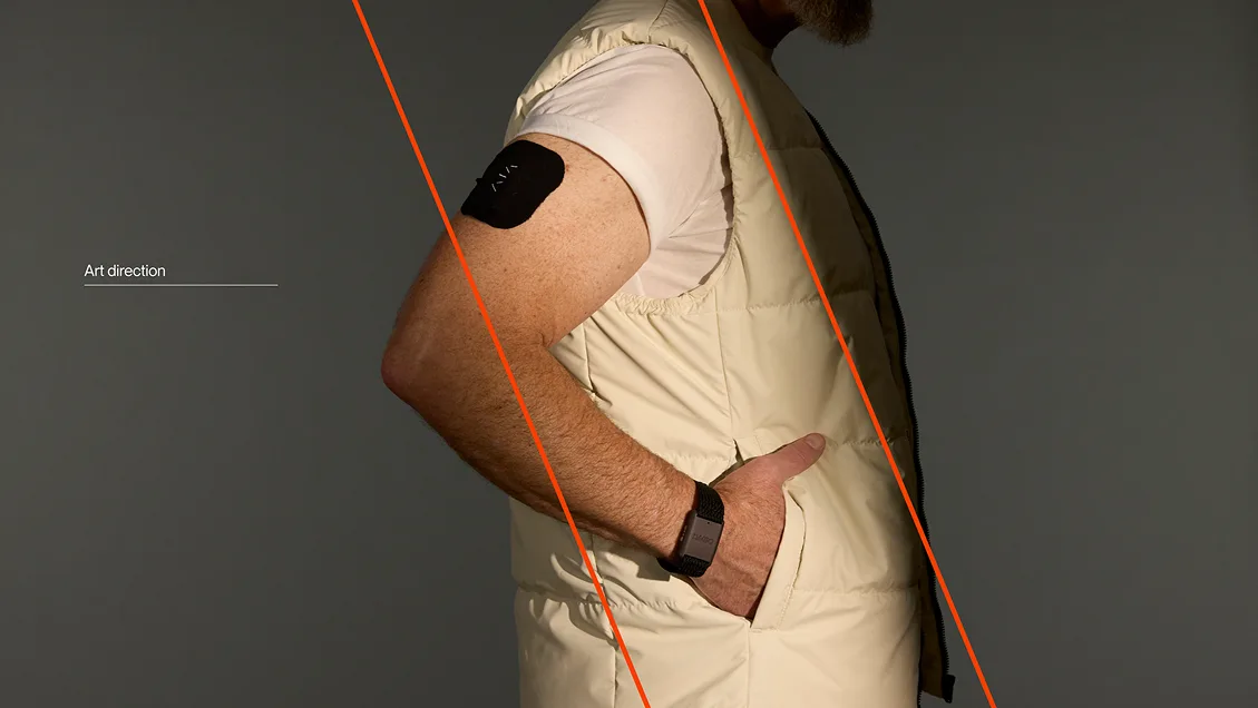
While the diagonal is ever-present in the brand, we didn’t want to overuse it or it would feel too corporate. So we opted for typographical moments, angling of objects or lighting in photography, and smaller patterned moments tying the logo in to the grid of the layouts.
Brand Guidelines
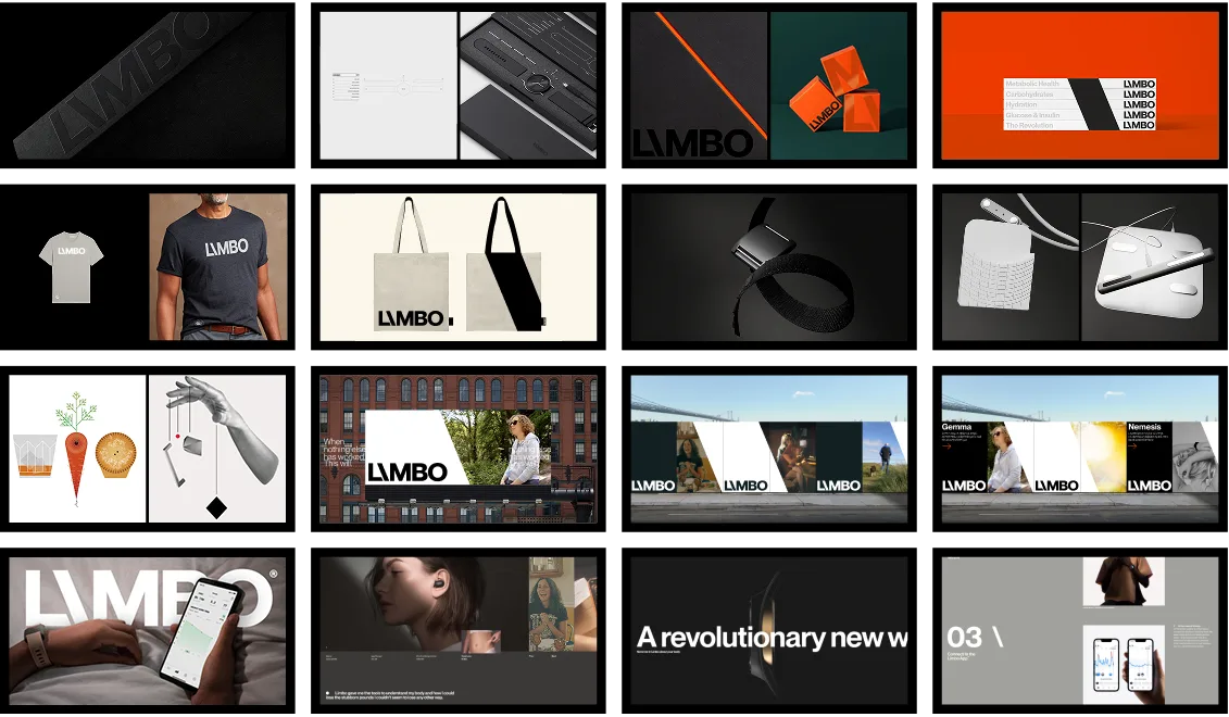
In Application
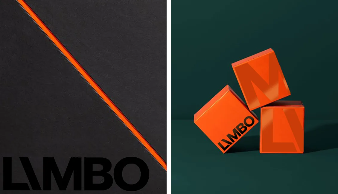
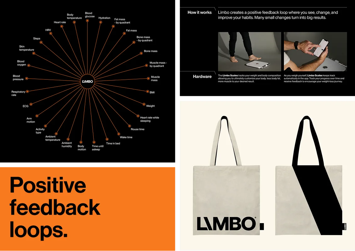
Photographic Style
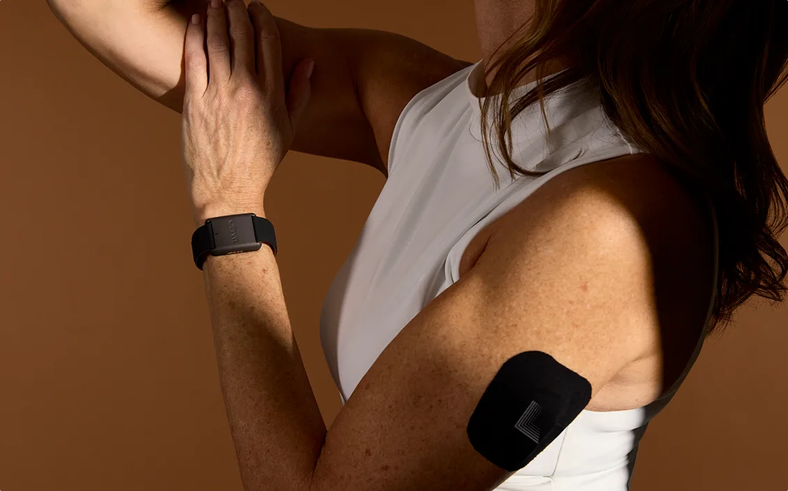
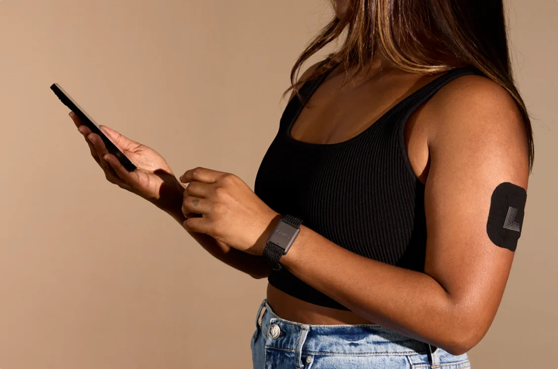
The stylized, branded photography didn’t show any faces so that the real users would be the faces of the company.
App and Website Redesign
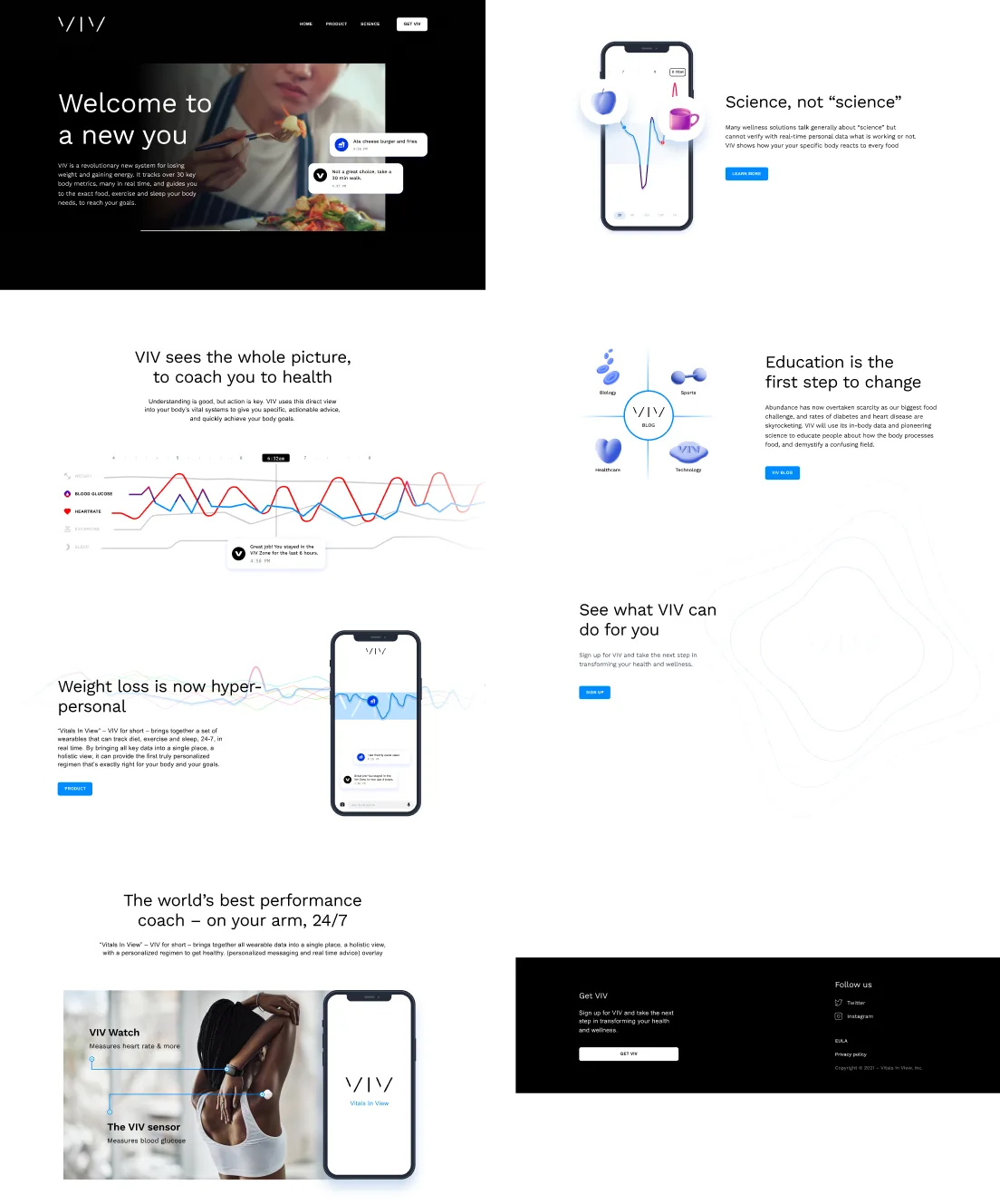
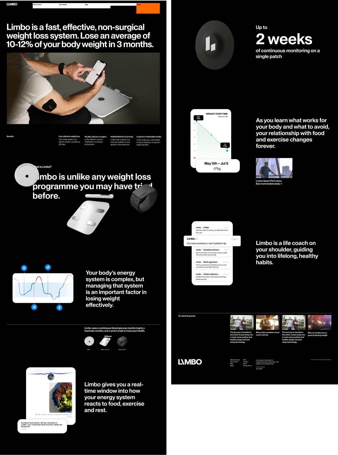
The investors wanted a brand-new website—fast. The old one wasn’t just outdated; it was actively hurting the business. Small tweaks weren’t cutting it anymore, and worse, they were wrecking our SEO. We had no choice but to start from scratch, and we only had three weeks to do it.
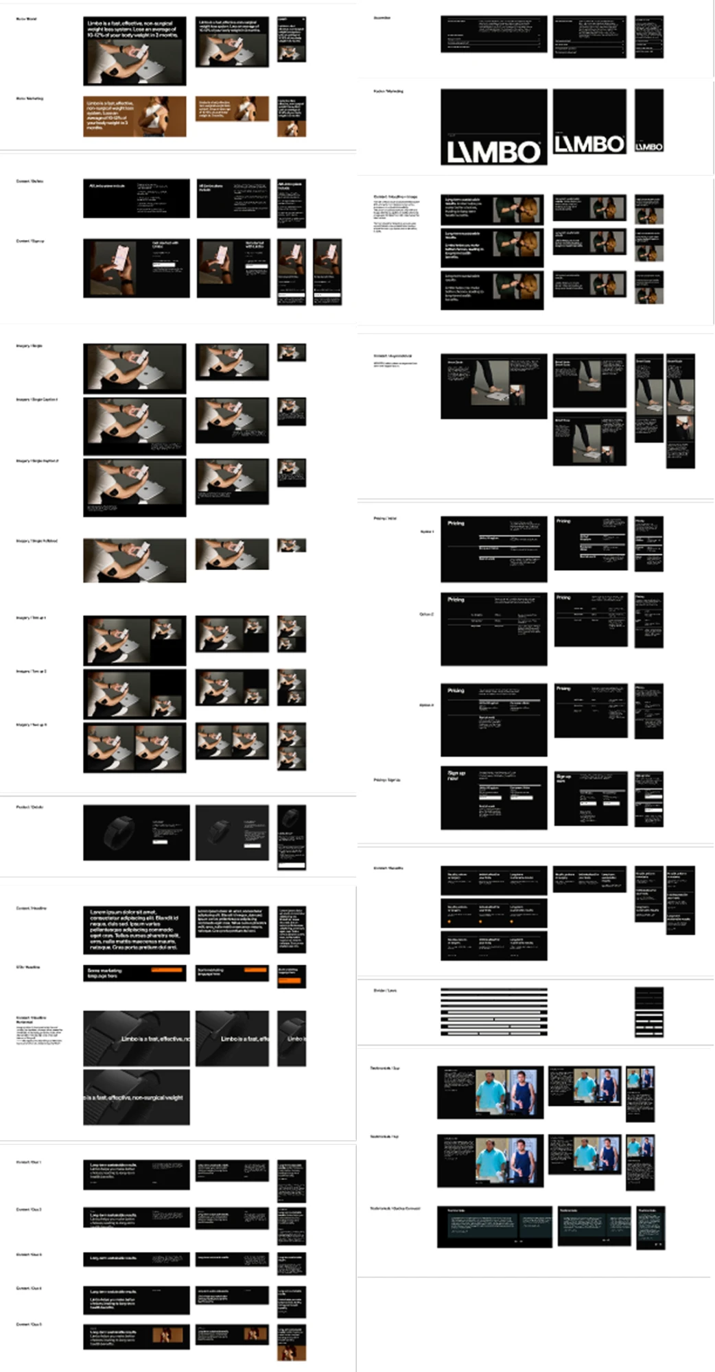
I jumped in to plan the sitemap and organize the content layout. Marketing took it from there, creating content to fit the structure we designed. To make the new site flexible and easy to update, we built families of CMS modules. These made it simple to add, remove, or customize features as needed. While we focused on usability and structure, Anna took charge of the photoshoot, coordinated everything like a pro, and worked closely with development to QA every detail.
It was a fast-paced, intense project, but it was also exciting. Everyone pitched in, and the end result was something we were proud of—a site that not only looked great but also met every one of the investors’ goals.
After the launch, things took a turn. Budget cuts meant our team was let go, and Marketing took over managing the site. They simplified the design to make it easier to handle without a dedicated team. It worked, but it lost some of the polish we’d poured our hearts into. Even so, that project was a reminder of how much a team can achieve under pressure when everyone works together.
Original Landing Page
New Website
CMS
- Skills
- User research
- User experience design
- Redesign of mobile application
- Development and execution of brand identity
- Systemization of brand principles, tone of voice
- Team
- Lead: Anna Fine
- Designers: Willie Shaw Fineberg, Laura Pursell
- Product: Orla Caiside, David R
- Branding studio partners: Tina Smith Design, ZinZin
- Photographer: David Chow